I often think with gratitude to the men who built the house in 1902, made the unique ceiling, hewed logs by hand. The work of the interior architect helps to recall the past – it’s authentic, beautiful and emotionally warm. The builder, too, found joy in such a special building. It was a very enjoyable and creative process.
Ene Maaten, customer’s representative, then municipality mayor
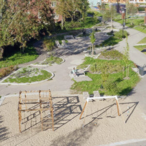
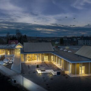
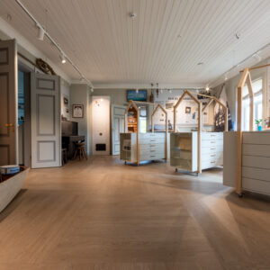
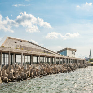
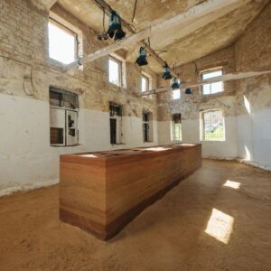
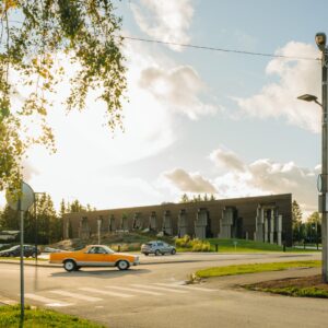
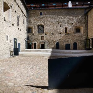
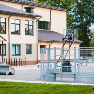
FIRST ENCOUNTER. The building looked appealing on the outside, but was in a very poor shape on the inside. Most recently, a school had operated there, yet since 1989 the building had been out of use. In the attic, we found folding desks from three different eras. I was most inspired by the local people, however, when we went to eat at a local cafeteria with the municipality mayor, Ene Maaten. There, the people for whom the building was being constructed, were having lunch. Rich and poor, children and the elderly, some with one tooth, some with gold teeth. A colourful bunch.
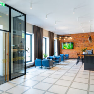
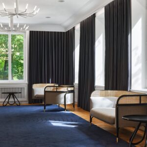
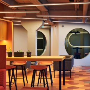
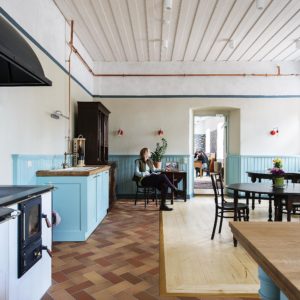
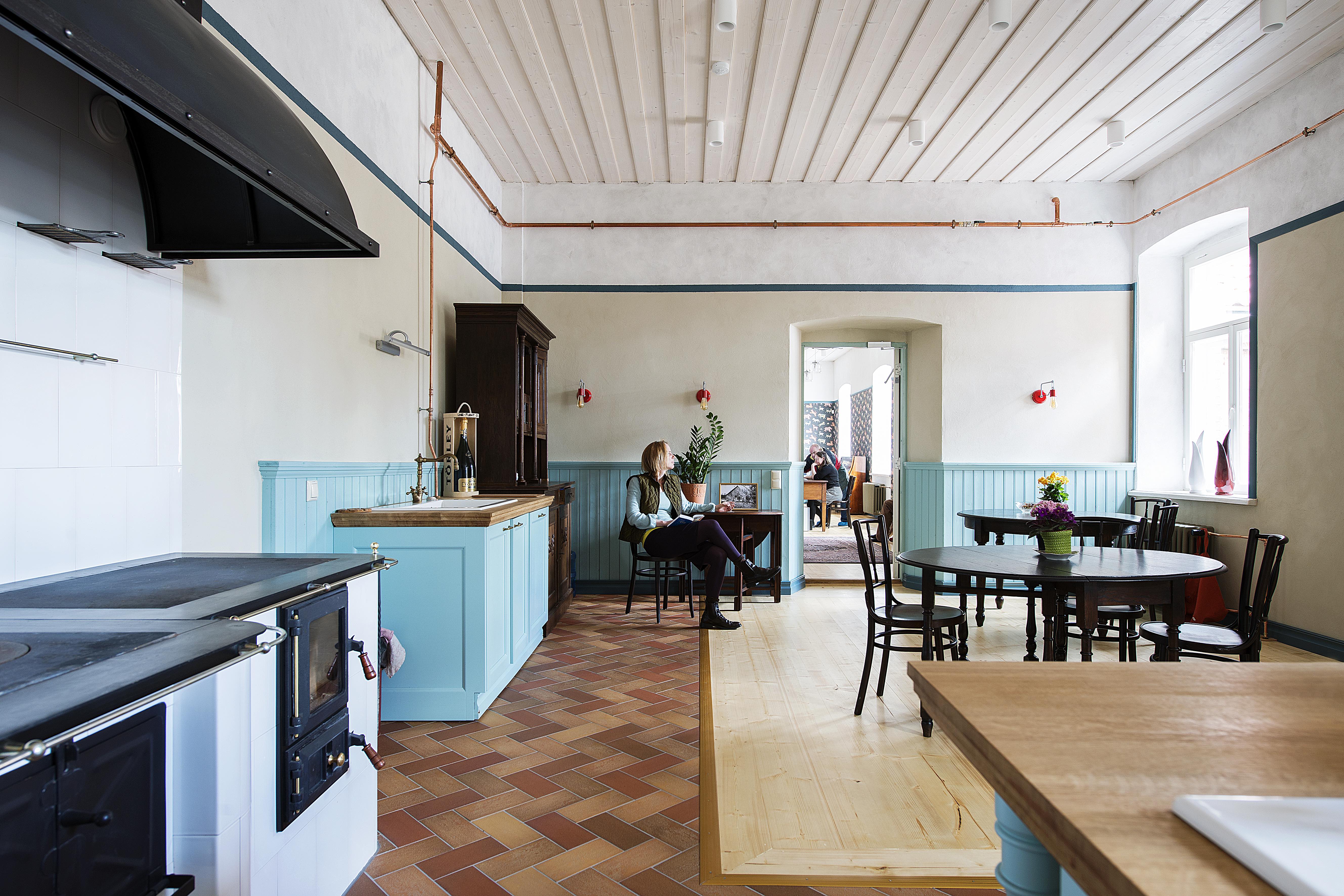
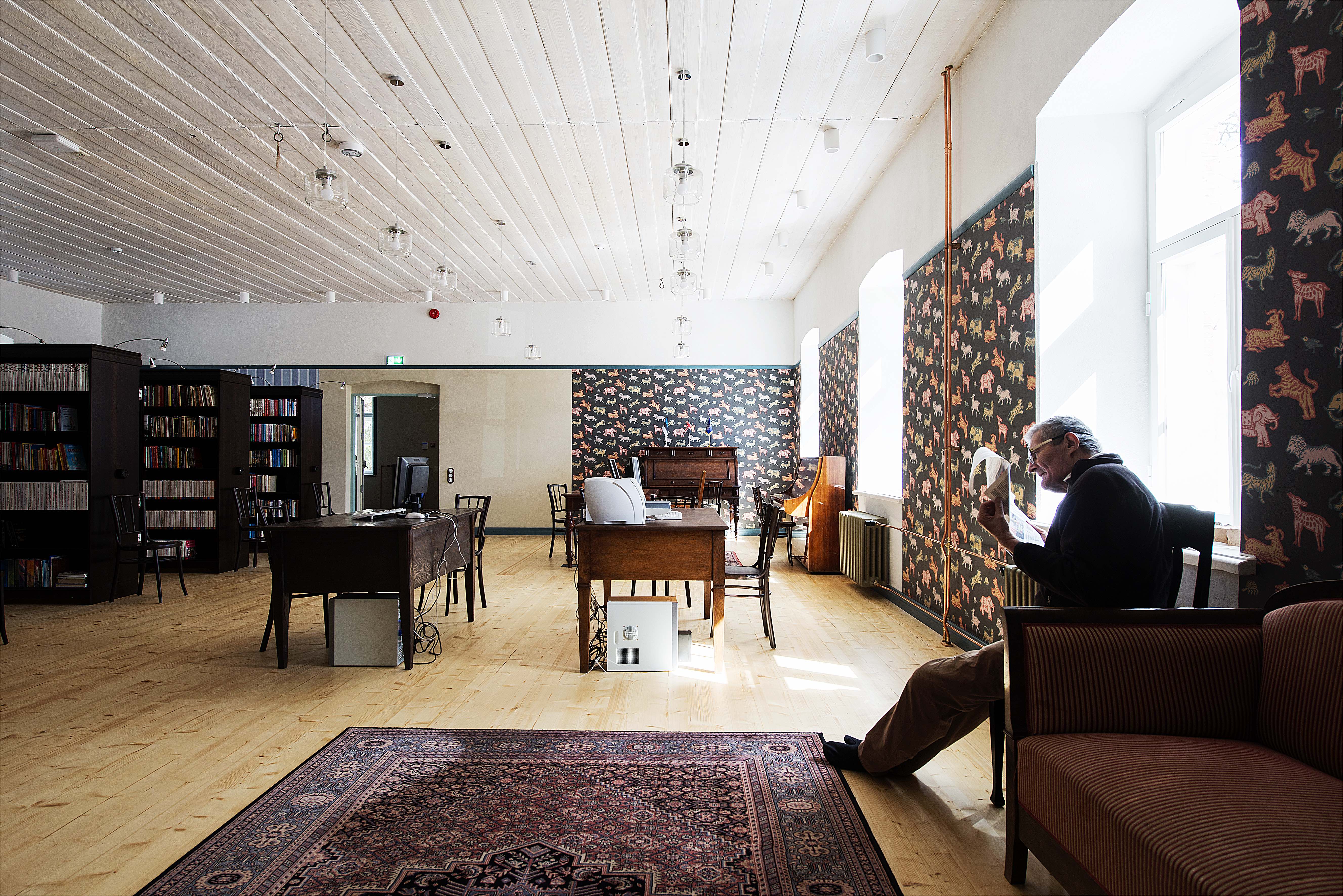
THE CUSTOMER’S DESIRE was for the village folk to feel themselves at home there. The local government, library and St. Ann’s congregation also needed new premises. The kitchen should have the facilities to bake bread together, to fetch kindling wood for the wood-fired stove. The customer wanted a house with character, and that suited me: lots of paint, authentic material, texture, wallpaper patterns, textile. It’s not my style to use only two details to bring an empty room to life.
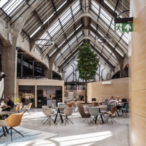
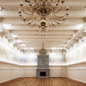
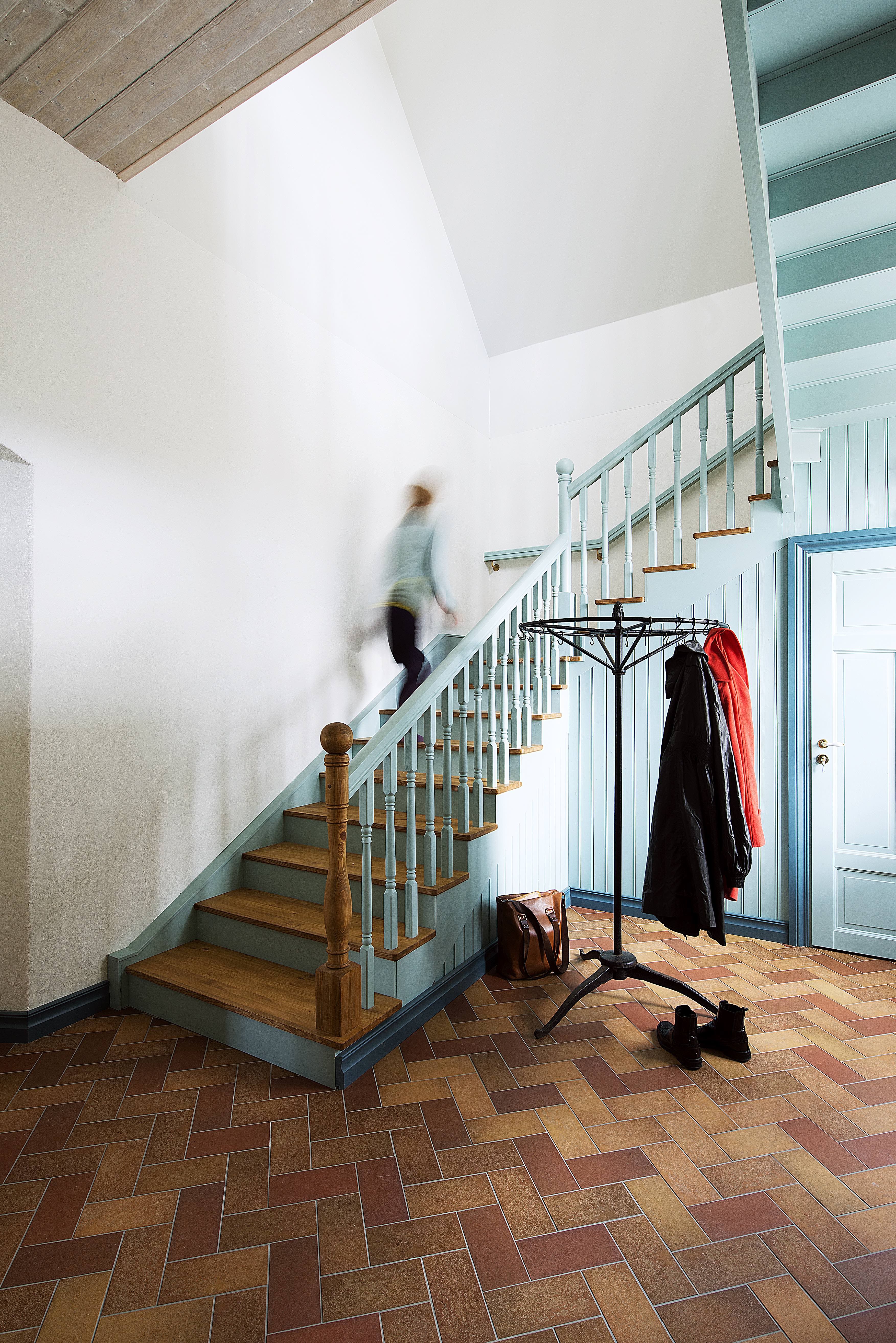
TWO WINDOWS WERE ALL THAT WAS LEFT OF THE OLD. Miracles were made with the ceiling, we managed to largely save it. It partially conceals the complicated system used to tension the beams. Wood is the material that is most used, and there are many plastered surfaces. The floor in the dining room and the antechambers is covered by brick, which was inspired by a similar small patch of floor I found in the cellar.
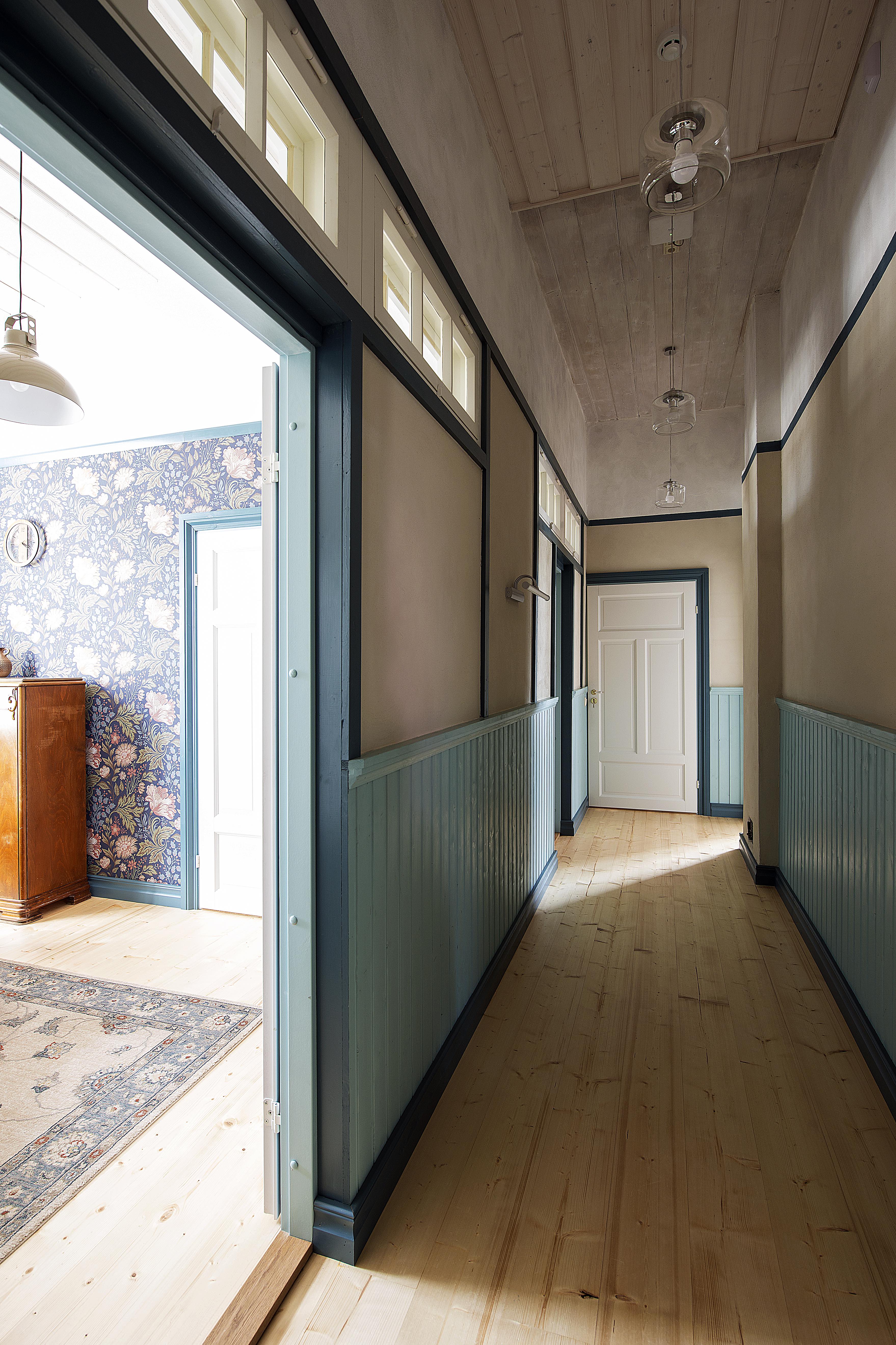
WRACKING OUR BRAINS. Forced-air ventilation was not desired and this meant quite a lot of trouble for the architect. I expended a lot of effort myself to get the wallpaper into the right system – because the ceilings were so high (3.50–4.10) – I didn’t want to go all the way up to the ceiling with it. I really had to put my head to work to ensure that the proportions would be in place for the wood panelling and dado rail. I gained new knowledge about how to conceal the dado rail in plastered surfaces.
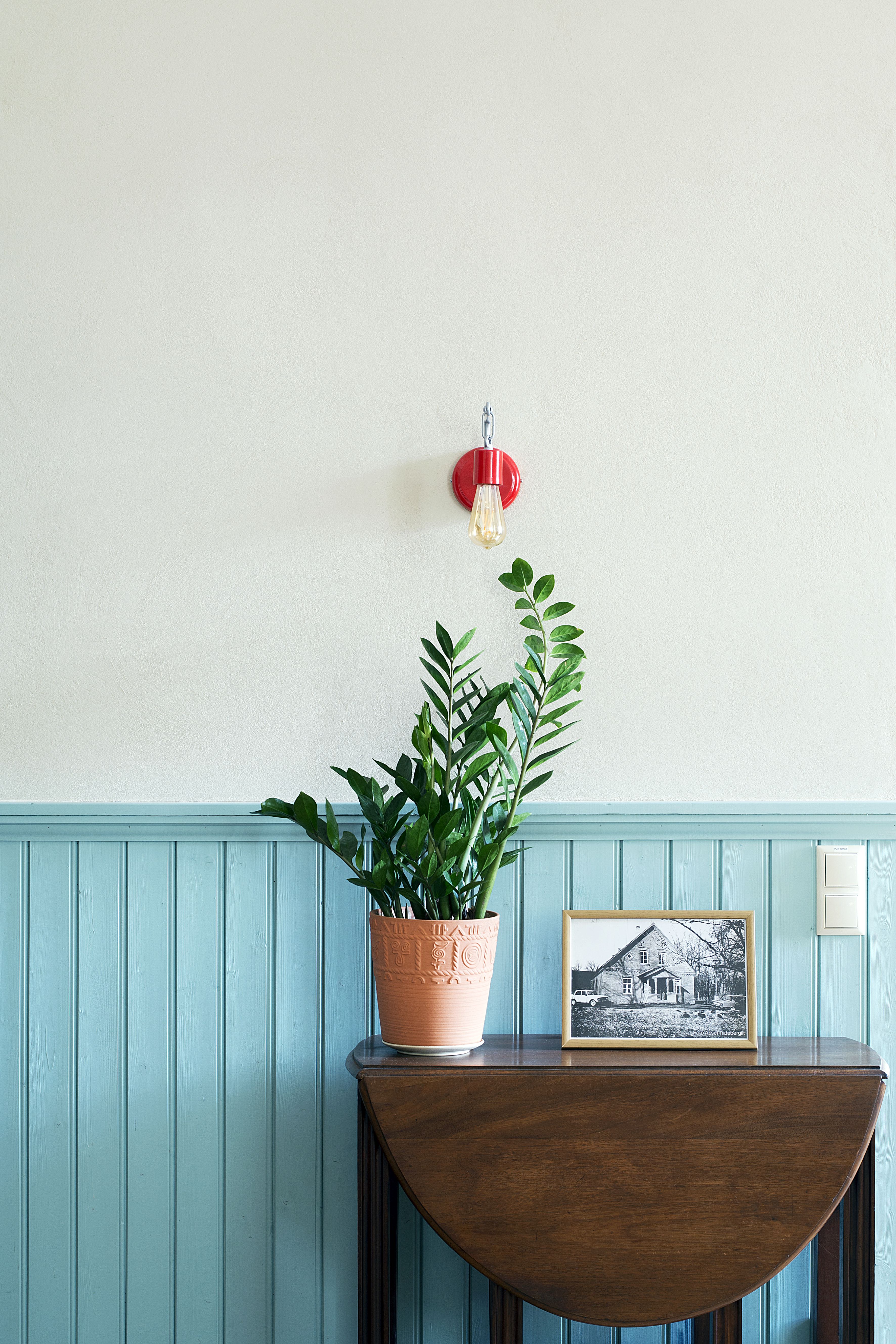
The customer and I bought furniture from antique showroom websites one piece at a time. Unfortunately, due to budget cuts, the lights we originally planned for the ceiling had to be omitted.
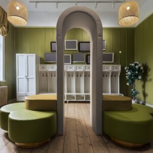
COLOURS. The red wing of the house seems like a logical continuation of the brick. Blue is a memory from my childhood, from my aunt’s house, which is in the same area. Her house had wood panelling with a soft colour. At first, I, too, chose light blue wallpaper, but it went out of production (the design was completed the year before the beginning of construction). So the wallpaper ended up being dark blue. The cheerful patterns feature moose, squirrels, and tigers. The municipality mayor’s office has horses on the wall – the mayor has four horses at home like some people might have a dog.
I’M ESPECIALLY HAPPY with the folding wall between the two private offices – the panelled wood wall can be opened to join the two small rooms into one. My favourites are the views when you are standing in the back room – through the open doors you can see all the way to the other end of the building – the wallpapers, floors and carpets and all of the rooms.
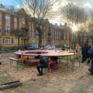
I felt like I was giving the gift of dreams through my work. Even children of modest means could see that it is possible to live in a beautiful environment. Perhaps they will want some of that in their lives in future, too. And the municipality was forthcoming in so many things: go for it, you’re creating a fairy-tale.
Liis Tarbe