The more jaded view is that all things are becoming commercially and visually similar everywhere. So perhaps that is why it is quite refreshing to see an exhibition that talks about a need for houses, regardless of how they are defined. In this case, it is my interpretation that we are looking at houses as vehicles or vessels for architectural thinking, but in a way that is very much rooted in the media-centred and mediated contemporary experience. /…/ I do feel I ultimately exit the exhibition with a far more hopeful sentiment rather than it just adding to the already existing angst about the future that so many of us share. The best parts of the exhibition I think try to reach beyond scenarios where the world as we know it will in some ways end, fade away or change. They show that architecture or vision-building does not automatically end at the end of the world. While this is arguably an architecture-centric view, it still is an important conceptual addition to the mainstream conversation about sustainability and green buildings. Obviously, all our focus on sustainable technologies and solutions is commendable, but we must acknowledge that much of the sustainability talk still somewhat assumes that the overall societal or economic development narrative will remain the same. The hopeful message is that architecture has its freedom and design can be intellectually and artistically possible regardless of the circumstances and future scenarios.
Mika Savela, architect „Maja on maja on maja“, MAJA, Autumn 2021
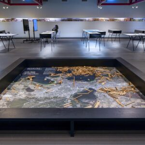
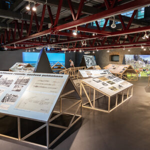
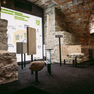
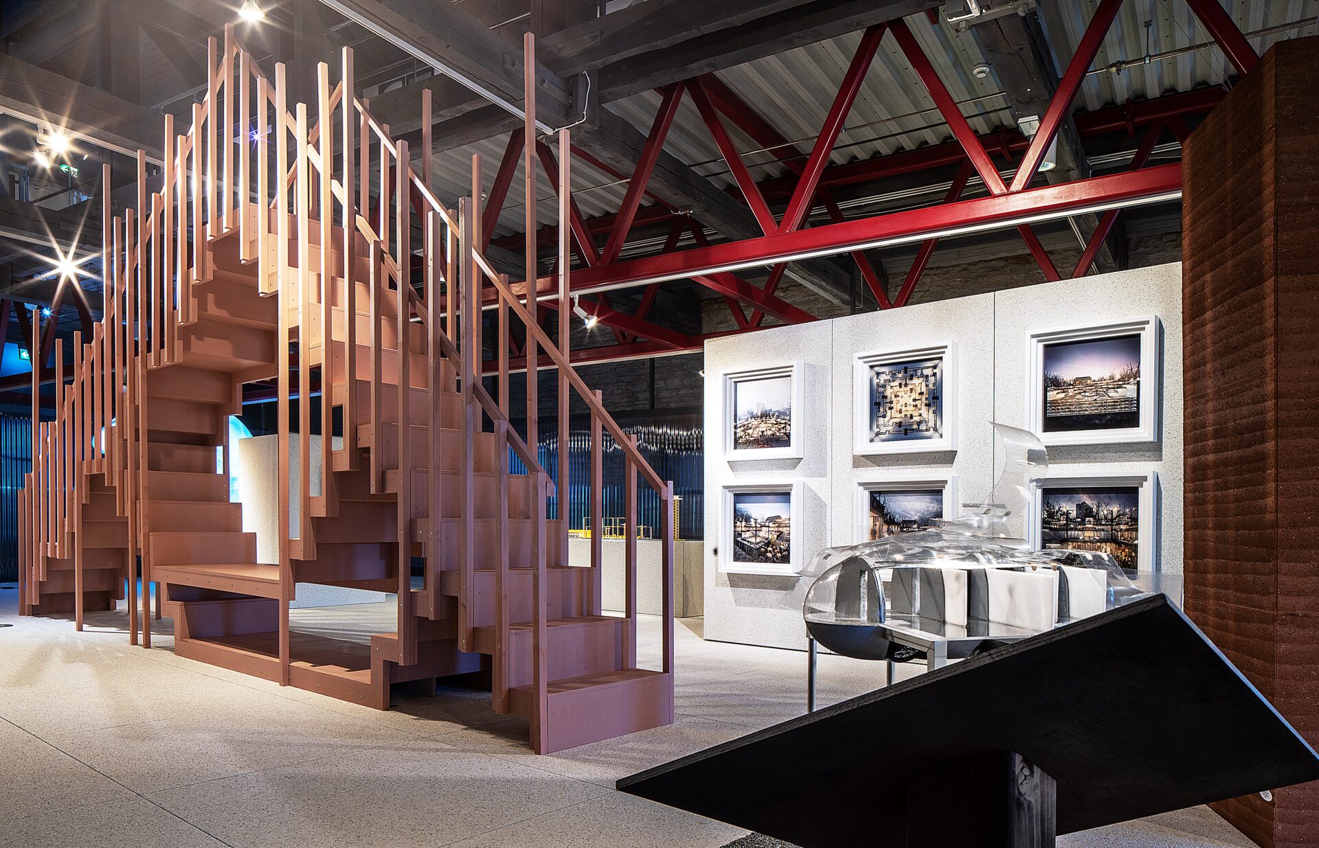
Looking at how utopias have been depicted over history, one thing that stands out is that they are isolated, cut off from the rest of the world. For instance, Thomas More depicts utopia as an island, while Buckminster Fuller places a glass dome over Manhattan. Since The Houses We Need conjures up visions of future utopias and dystopias, the architects had the idea to design the exhibition space using a room-in-room principle.
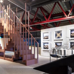
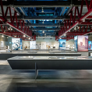
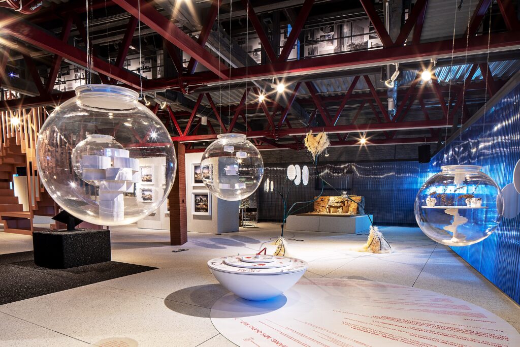
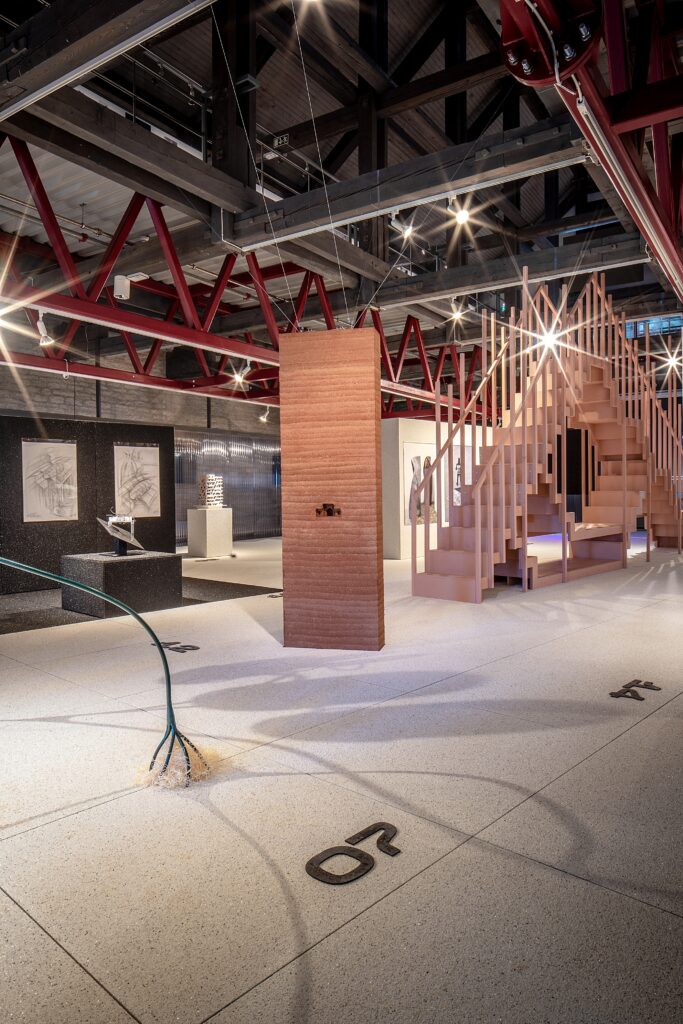
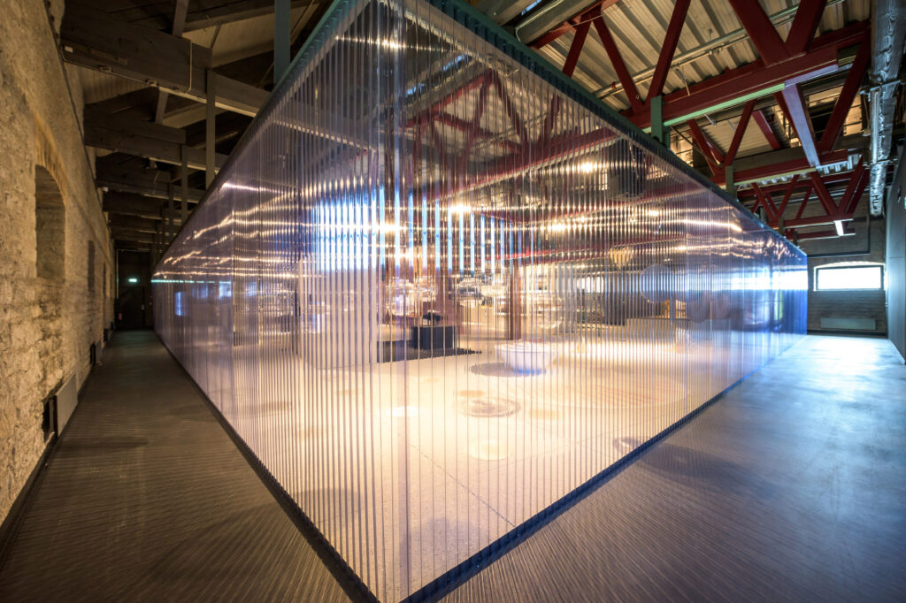
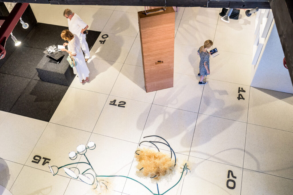
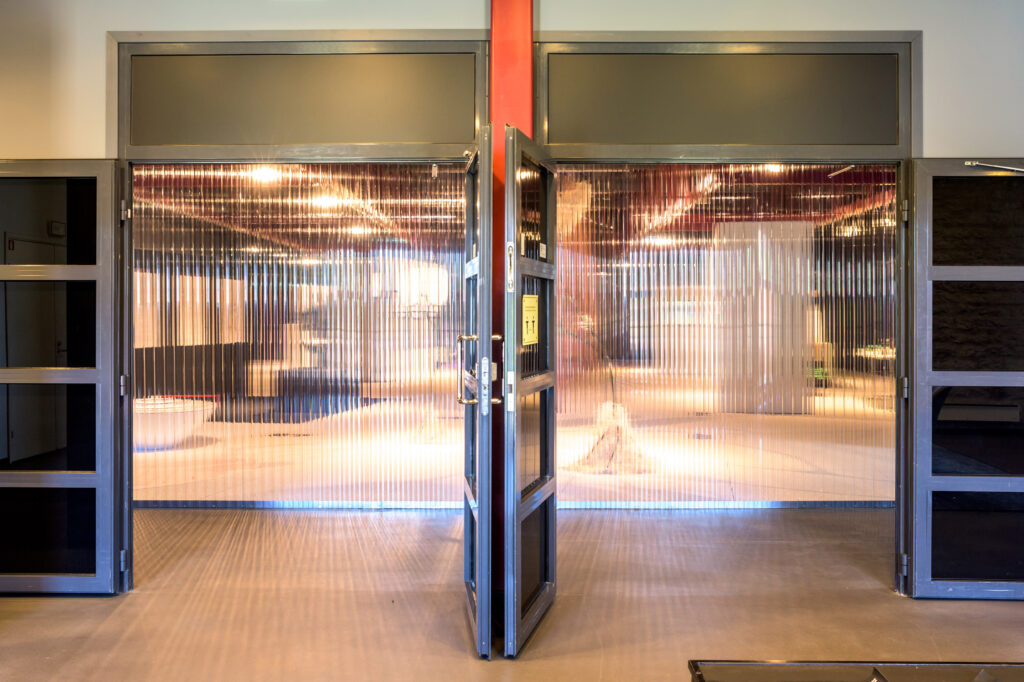
Yet it cannot be said that (anti-)utopias would be completely independent of the real world – it’s more like there is a certain reality shift. Thus, it was decided to retain references made by the exhibition space to the surroundings. A PVC trapezoid structure gives an indication of what lies beyond, and the exhibition venue’s ceiling has been left open as well, allowing a glimpse of the top-floor exhibition hall through it. From the latter, it is possible to observe goings-on down below like a world in a glass display window.
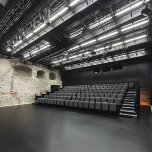
The spatial shift makes it out of sync with time, in a certain sense. First of all, visitors who enter the hall find themselves in front of a translucent PVC screen, while the exhibit items can only be faintly be made out behind it. To access the exhibition, one has to walk in limbo between the limestone wall and the screen to the other end of the space. A certain shift in time takes place en route from the entrance, ushering in a future-themed exhibition.
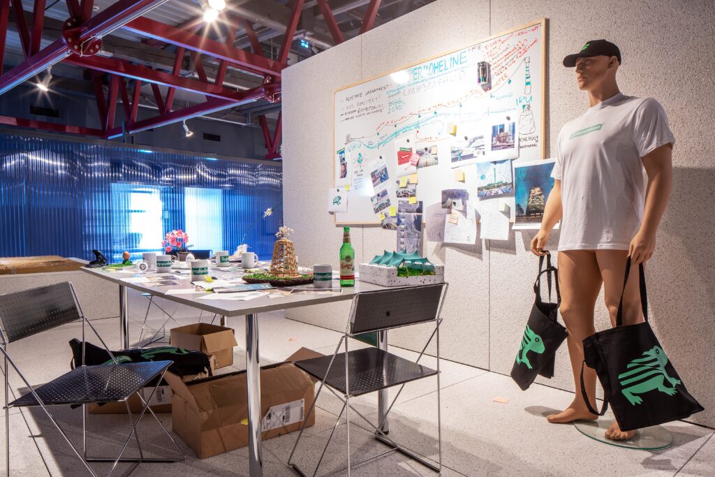
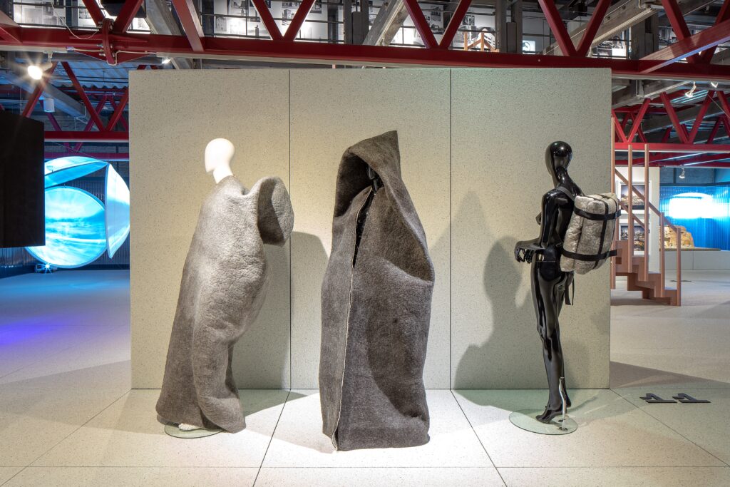
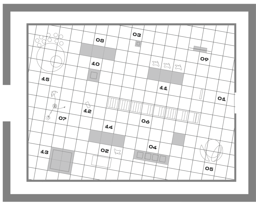
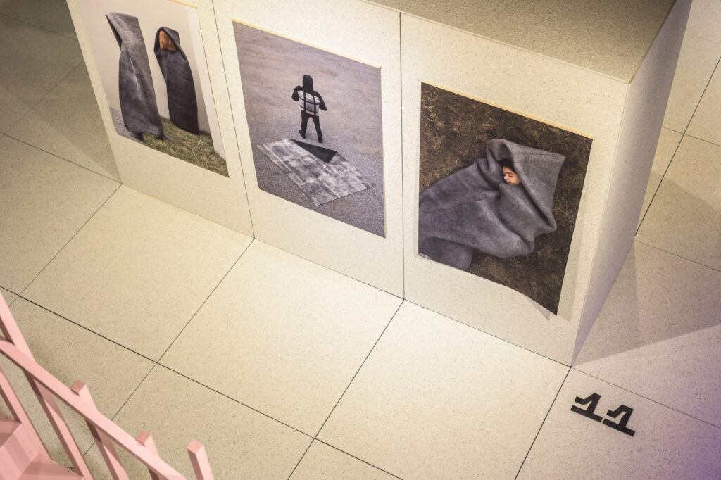
The architects tried to avoid making moral judgments. The choice of material was based on the concept of creating a uniform three-dimensional backdrop for the whole exhibition, which would be suitable for the floor and the vertical surfaces stemming from the floor. It was also important that the material could be re-used again later on. The façade panel modules, installed with accentuated joint spacing, create a “space odyssey” landscape.
Source: MAJA
Looking at how utopias have been depicted over history, one thing that stands out is that they are isolated, cut off from the rest of the world. For instance, Thomas More depicts Utopia as an island, while Buckminster Fuller places a glass dome over Manhattan. Since The Houses We Need conjures up visions of future utopias and dystopias, the architects had the idea to design the exhibition space using a room-in-room principle.
Yet it cannot be said that (anti-)utopias would be completely independent of the real world – it’s more like there is a certain reality shift. Thus, it was decided to retain references made by the exhibition space to the surroundings. A PVC trapezoid structure gives an indication of what lies beyond, and the exhibition venue’s ceiling has been left open as well, allowing a glimpse of the top-floor exhibition hall through it. From the latter, it is possible to observe goings-on down below like a world in a glass display window.
The spatial shift makes it out of sync with time, in a certain sense. First of all, visitors who enter the hall find themselves in front of a translucent PVC screen, while the exhibit items can only be faintly be made out behind it. To access the exhibition, one has to walk in limbo between the limestone wall and the screen to the other end of the space. A certain shift in time takes place en route from the entrance, ushering in a future-themed exhibition.
The architects tried to avoid making moral judgments. The choice of material was based on the concept of creating a uniform three-dimensional backdrop for the whole exhibition, which would be suitable for the floor and the vertical surfaces stemming from the floor. It was also important that the material could be re-used again later on. The façade panel modules, installed with accentuated joint spacing, create a “space odyssey” landscape.
Source: Book “Ruumipilt 2021“


